COLLAGE ICONS
These are a couple of quick collages I use as avatars around the joint - I'm hoping to expand on them further next week


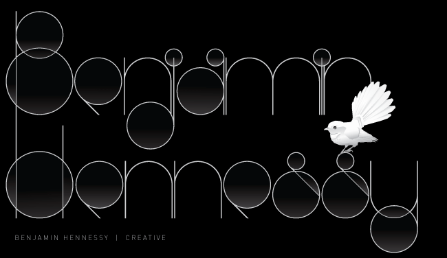
NOW FREELANCING
As of this week I will be saying goodbye to Ink Project. I have had a great 2 1/4 years there but felt it was time for a change, so as of July 1st I will be available for freelance and possibly full time employment.
I will be posting a link to my revised folio in coming days.
Please email benmakesmarks@gmail.com for any inquiries.


14 | 17 | 18
Here are some mix cd's I made - just a personal project to practice my collage.
The numbers 14, 17, 18 are the number of tracks on the cd but the number also informed my collage. They are representative of age and the interests of people at that age.


DRP VWLS NT BMBS
What else do I need to say? There are bigger problems than the state of written English


Tommy Trash - Lover Lover feat. Patsy Galore
This is the original cover I made for Tommy, the final was changed slightly but I prefer this version


My Old Folio - 2005ish
Just click the title above.
This is my OLD folio... get that? OLD.Just scroll down for the newer stuff and stay tuned - I have a bunch of work to throw up this weekend.
LOVE OR DEATH
I was watching Leon aka. The Professional, the other day and loved the line 'love or death' - so I made a type treatment for it. I love the porcelain feel of it, it looks really fragile. This would look nice on a vinyl record cover all worn and beat up... might have to mock that up

POSTHOUSE | THE POSTHOUSE ROOMS
These are some logos done at Ink Project for Sam's parents' new cafe in Berry - The Posthouse. There is also accommodation upstairs, hence, The Posthouse Rooms.


JAWS
Here is a little illustration and some type experiments I made for my alias JAWS. I tend to make up little names and just make logos them - just a bit of fun plus it's good practice for mark-making


SHOWCASE
This is a channel I branded for TVNZ at Ink Project. I created the logo and look of the package with the team here and had a real neon sign made :) The whole channel is based on curiosity and the unexpected. I will try and track down a video of the package and the ID's - soon!


LETTER
I wrote this the other day - was thinking of doing a little something with my buddy Josh called The Letter T's . Thought the word 'letter't looked nice so here it is... that is all.

Coke Commercial
This is a commercial directed by Ken Lambert of Ink Project - I helped ken create the look of the commercial and also designed all of the neon elements. Here are the initial styleframes for the neon and the finished commercial.
It won't let me upload the video right now - grrr I'll sort it out soon

MAKES MARKS
Here is a font I created - very jungle-y. All of the letters have 2 versions - one with a heavy top weight and the other with a heavy bottom weight - this is so any combination of letters will fit together nicely.


Subscribe to:
Posts (Atom)